A Change in Format
For as long as we can remember, we have been sending a paper market commentary by mail every quarter to our clients and friends. You probably wouldn’t have guessed it, but we have always felt a bit constrained by a 2 or 3 page paper commentary. How can we highlight what is most important on just a couple of pages, only four times per year?
Since we’ve introduced our blog, It’s More Than Money, we are now able to highlight a number of different aspects of the financial world, but in shorter, more regular, and easier to digest installments.
So with our ongoing Quarterly Market Commentaries, we are going to stick more to the “nuts and bolts” of what happened in the financial markets over the quarter and hope that our other blog posts will highlight the holistic approach we take to wealth management.
A Quick Recap

Our favorite chart to capture the variability of investment returns is the above patchwork chart produced by a number of different research firms, here we see J.P. Morgan’s (click to enlarge). It highlights annual, year to date, and average annual returns for 9 different asset classes plus a combined balanced asset allocation portfolio (which is seen in the grey boxes and charted by the black line.)
We love this chart because it shows the variability of returns and the futility in “picking” winners and losers among asset classes. The tiny white number in each box does a poor job at showing the billions of factors, market participants, emotions, and transactions that produced such a number. The need for a diversified portfolio, tied to a rational asset allocation, is as important as ever.
After producing near bottom of the barrel returns for the last 3 years, Emerging Markets have outshone all other risk classes with a 11% positive return year to date. While the S&P 500, shown in green as “Large Cap”, has added 6% to it’s 2016 gains. Even Fixed Income, in the face of increases in interest rates, has remained fairly stable.
More Motivated Buyers Than Sellers
We’re often asked (and ask ourselves) why a certain investment or asset class goes up in price. We’ve heard over the years the tongue in cheek answer: “there were more buyers than sellers.” But we use a much more fitting statement: “there were more motivated buyers than sellers.” If I’m selling my house, sure it probably helps to have more buyers than sellers, but what I really want are motivated buyers. So where was the motivation so far this year?
In the Foreign Emerging Markets (and Foreign Developed Markets to a lesser extent) we could likely pin most of the blame of reversion to the mean. Over the last decade, foreign markets just haven’t recovered from the pains of 2008 at the same rate as US based markets.
The US Stock and Fixed Income (Bond) markets present a far more complex “little white number” to explain, partially because we believe they are very much intertwined. The US Stock market is, at least in part, propped up by the record low Bond yields (which make their prices look even worse in a rising rate environment). Likewise, the US Bond market is, at least in part, propped up by the record high valuations in the stock market. To borrow from Johnny Cash’s mention of his “cleanest dirty shirt”, we see most US investors having two shirts, equally dirty, and so they both get worn.
Not All Heroes Wear CAPEs
Most investors are knowledgeable about P/E ratios; the Price buyers are willing to pay for each dollar of a company’s Earnings. A lesser-known offshoot of P/E is the Cyclically Adjusted Price-Earnings ratio or CAPE. It is also known as Shiller CAPE…as in Robert Shiller who wrote an editorial for the NYT on March 31, 2017 titled “Caution Signals Are Blinking for the Trump Bull Market”. As Shiller notes:
In 1988, we found CAPE had averaged about 15 since 1881. In years when CAPE was lower than that, subsequent 10-year returns for the stock market tended to be good. In years when it was higher the 10-year returns tended to be bad.
That’s why today’s CAPE is sending a troubling message. The ratio is now almost 30. Using monthly data, it has been higher only in 1929, when it reached 33, and in a few years around 2000, when it reached 44. In both instances, sharp market declines followed those very high readings. The current level of CAPE suggests a dim outlook for the American stock market over the next 10 years or so, but it does not tell us for sure nor does it say when to expect a decline. As I said, CAPE is useful, but it does not provide a clear guide to the future.
As Shiller makes sure to point out, CAPE is no perfect predictor, but it certainly carries some weight. More importantly, time horizon plays a big role.
There is an absolutely great visualization of this P/E ratio link to Real Returns on the Of Dollars and Data blog (graphic below). The blog’s author used P/E instead of CAPE but the impact is the same. We can see that as we are able to buy stocks on the “cheap” (low P/E) we typically have higher returns over the next 10 years. As we pay more for each dollar of earnings (increasing P/E) the number of green periods are fewer. In other words, the same goes for stocks as it does cars, houses, or any other asset: the more one overpays in the beginning, the harder it is to make a good return. To note, the US market has a P/E of around 17.5.
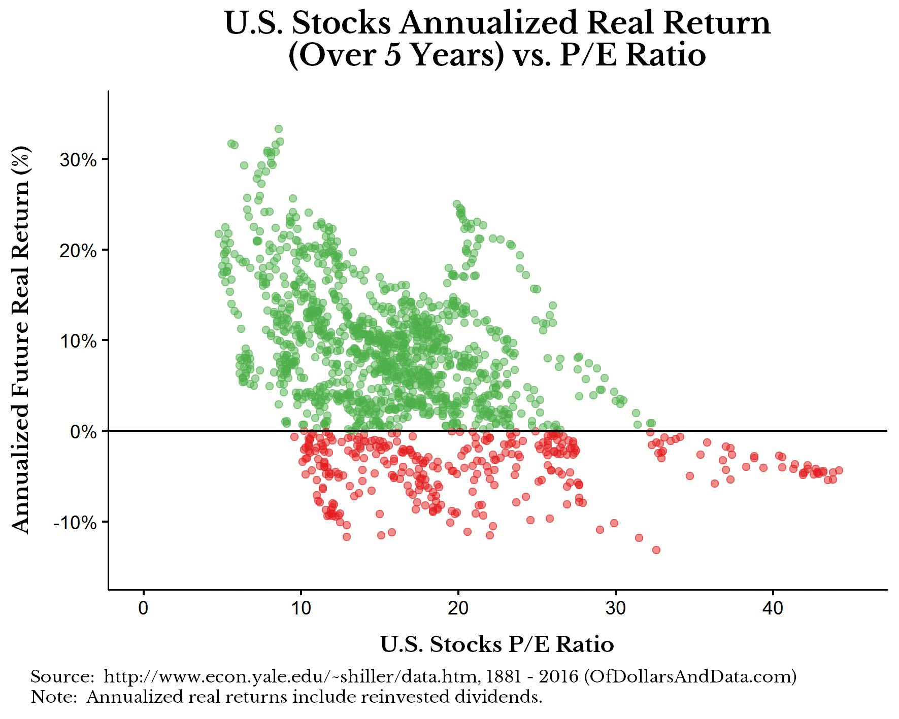
The encouraging point to note is that once we follow the chart to 15 years, it is hard to find many red dots. In fact, once we get to 20 years, they do not exist. At that point, the higher returns are still gathered together on the left side of the chart (years with cheaper starting prices) but the differences are small.
What’s My Motivation?
As I noted above, there haven’t necessarily been more buyers of stocks, just more motivated buyers of stocks. We believe one of the biggest motivators for stocks has been the gloomy bond market. As investors are faced with 2.4% yields on the 10 year Treasury, and the prospect of more rate increases in the future (which typically bring lower bond prices) what motivation do they have to buy bonds?
We have shown this chart before, but it is worth revisiting. It shows the relationship between the 10 year yield and correlation between yield direction and stock price direction. In other words, when the yield is low (like we have today) we tend to see rate increases coincide with stock price increases. This captures the dilemma today’s investors have: if I’m being paid very little by my bonds and those bond prices are likely to go down, I’m more motivated to own riskier assets like stocks.

Opportunity Cost
If we could teach one economics lesson in today’s schools it would be “opportunity cost”. It demonstrates, for example, that college costs a lot of money…but not nearly as much as the missed income from not going to college.
In the realm of investing, opportunity cost gets a lot more complicated. An investor must not only decide what to do with the next $10,000 (or $100,000 or $1,000,000) but must also take into account the cost of not doing everything else they could have done with those dollars (buy more bonds, buy more stocks, retire debt, give it away, spend it, etc.)
And that doesn’t just include the real return, but also the behavioral return. For example, anytime an investor is able to retire debt at 6%, it is the equivalent to earning a guaranteed +6% return. But we would also point out that if that debt happens to exact a great emotional burden on the investors, then paying it off would return even more than +6%.
We do not pretend to know what the future of the markets will hold. However, if we can know the opportunity costs involved in our total financial life, it will help us make better decisions and feel more confident about the ones we have made. A confident investor who knows they are on track for their goals (no matter the short term movements in the markets) is able to increase their odds of success but not having to pay attention to the noise.


Justin Smith
Latest posts by Justin Smith (see all)
- Quarter in Charts – Q4 2023 - January 24, 2024
- Quarter in Charts – Q3 2023 - October 19, 2023
- Quarter in Charts – Q2 2023 - July 19, 2023