Why Bookies Don’t Work Local Swim Meets
My wife and I have been in the thick of swim team at the neighborhood pool. With our 9 and 7 year-old girls on the team and their 4 year-old brother to cheer them on, Tuesday nights take on a whole new meaning.
By far, the most entertaining events are the 6 and under heats. These kids are a perfect combination of adorable and unpredictable. Most of the time, the #1 ranked kid will finish first, but sometimes there are surprises. One swimmer might get distracted and miss the starting beep, another might get hung up on the lane rope, and still a third might decide mid-race to switch strokes.

Where are US Stocks in Relation to Historical Starting Lines?
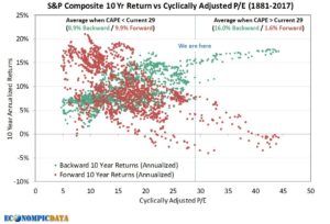
I recently stumbled on this blog post from The Cook & Bynum Fund in which they reference a chart from EconompicData. They look at starting position in the market and where different investors would have come from (green dots) and where they would eventually end up (red dots).
As with a swim meet, just because someone starts out in prime position (or poor position) it does not guarantee their victory (or defeat). However, the impact of starting position can not be ignored or chalked up to chance.
Below, we see backward looking returns (what happened in the prior 10 years) in green and forward looking returns (what would end up happening in the following 10 years) for all return periods, the S&P Composite’s past 136 year history seen through the eyes of Cyclically Adjusted P/E (CAPE). Two examples to help see how to read this chart:
- Look at the dots above a CAPE of 43 on the far right. This is typically known as an “expensive” market. The green dots show that when the S&P was priced at a CAPE of 43 (buyers of the S&P paid $43 for every $1 of company earnings), the average returns for the 10 years before that day were around 17% annualized (around the highest they had ever been). BUT, the more meaningful bit of information is that the 10 years following a CAPE of 43 (the red dots) are all clustered around negative annualized returns.
- Conversely, look at the dots above a CAPE of 5; typically an “inexpensive” market. The green dots show that when you start out at a CAPE of 5, the prior 10 years were made up of historically low returns in the 4-7% range. BUT, when you look at the 10 years that followed a CAPE of 5 (the red dots above the 5) they tended to show that 12-17% returns followed a CAPE of 5.
Today, we sit at a CAPE of around 29 (the blue dotted line). Typically when an investor has found themselves where we are today, they have enjoyed the prior ten years a lot more than they will enjoy the next ten years.
Why Investing is Harder Than Swimming
It is obvious at our swim meets who is projected to win. The advantage (being in the front) feels good and comes with no history of “pain.”
Investing, on the other hand, is quite the opposite. We can see from the chart above that to get a great starting position (CAPE less than 10) you would typically have had to go through some rough years. And conversely, to get a less favorable investing starting position (CAPE above 35), you had to experience some really great years. More importantly, you would have to have the presence of mind to realize you are likely drifting to the back of the pack in terms of the starting position for the next 10 years.
Take Your Mark
At the risk of sounding like an uninspiring inspirational Hallmark card: “Today is the first (investing) day of the rest of your (investing) life.” Every single day has a known prior ten years and an unknown future ten years. It matters how we invest, re-balance, and make financial decisions; probably more so at the extremes (above a CAPE of 30 and below a CAPE of 15) than in “normal” times.

