Q3 2017 Market Commentary
“All analogies break down if taken too far, just like a car. Only there’s no gas station & maybe the mechanic is an editor or logician & also…” – Ken Jennings, Jeopardy Champion
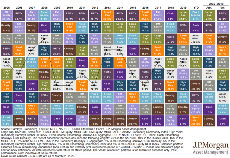
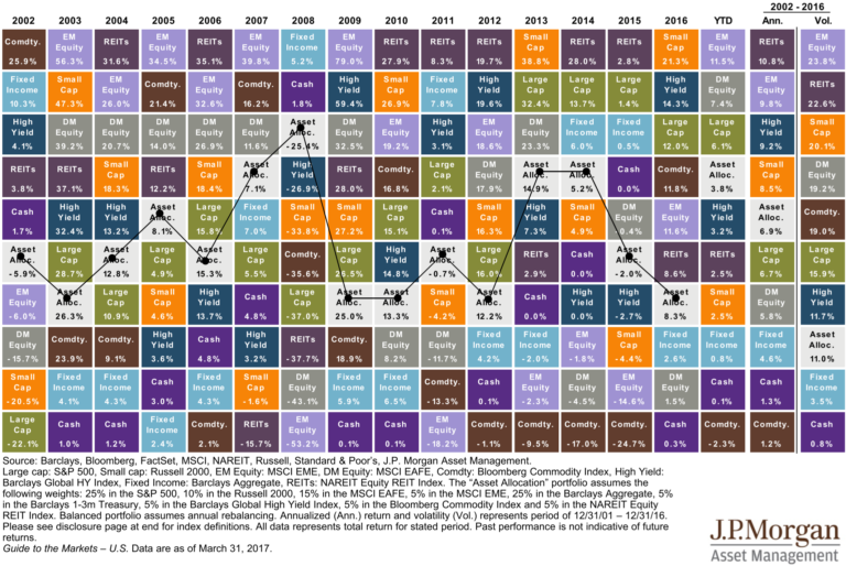
 Against the advice of Ken Jennings, and in order to better understand the stock market, we often talk about a different asset class: houses. Imagine, if you will, that each differently colored blocks in the chart above represents the average selling price of all houses in a city. For example, Orange might represent Raleigh, Blue could represent Detroit and so on. From one year to the next, the prices of some cities’ houses go up while the prices of some go down, even some cities’ prices remain unchanged.
The price someone is willing to pay for a house, regardless what city it’s in, can generally be broken down into two components:
- The total square footage
- The price per square foot
Square Footage = Earnings
The first component, total square footage, is easy to calculate. Get out a tape measure and in minutes we know the number of square feet in our house. Think of square footage like a company’s earnings (or in a broader sense, the market’s aggregate earnings.) The overall appeal of a house is still worth keeping in mind, but the square footage really drives pricing.
Picture a couple who happily puts in an offer to buy a 1,500 square foot house at the outer edge of their $300,000 budget. After the inspection, they discover the house is actually 1,350 square feet (10% smaller), not the 1,500 square feet they thought. You better believe they’re going to go back and ask for a 10% discount.
But why? It had all the bedrooms they needed, it would fit all of their furniture, the neighborhood was right, and the living room even had shiplap walls (whatever that is). But square footage, like earnings, is a big factor in justifying the price. If they felt their 1,500 dream home was worth $300,000, behavioral psychology says they won’t be equally happy to pay $300,000 for 10% less square footage.
Magic Houses
While companies’ (and thus asset classes as a whole) earnings can fluctuate, the square footage in most houses does not change overnight. As Ken Jennings would say, this is where the “car” breaks down for some people. However, let’s take some creative liberties. Let’s assume that, in our world, all houses tend to magically “grow” in terms of square footage. Like some poorly written 80’s science fiction movie, you wake up and your living room is bigger…we don’t know exactly how it happens, it just does. In this hypothetical world, some houses grow, some shrink, some disappear altogether…but on the whole they tend to grow at roughly 4% (which happens to be the average earnings growth rate in the S&P 500 since 1874, according to Robert Shiller)
Price Per Square Foot = Price to Earnings Ratio (P/E)
The second component, price per square foot, takes into account the desirability of each of those square feet. Similar to the stock market, in our magical “land of growing houses,” buyers and sellers would start to factor in estimates as to how quickly they think certain houses might grow…or shrink.
Imagine if the seller above, who overestimated the size of his house when he put it on the market, said he wouldn’t lower the price but he had it on good authority that his house would actually grow 10% (as in “magically add to its own square footage”) each year instead of the expected 4%. The desirability of each of those square feet would immediately go up, therefore justifying the higher price per square foot.
Back to the Market
The Wall Street Journal recently explored this market relationship in an article titled “This Market’s Running on Hope, Not Profits”. Reporter James Mackintosh noted that while corporate earnings (which are similar to square footage) have been growing, the price that people are willing to pay per dollar of earnings, also known as the price-to-earnings ratio or P/E (similar to price per square foot) has been rising more dramatically.
He points out that of 490 selected companies, only 16% grew earnings faster than their prices, 14% saw earnings grow while prices fell, but a whopping 70% saw their prices rise faster than their earnings. Some would say “the price went up, who cares why?” We would argue that if it went up based on earnings, that is much more justified and sustainable than because people are simply willing to pay more money for the same dollars worth of earnings.
What’s Next?
As human beings, we’re wired to try to predict what’s next. The problem is that humans are perpetually bad at predicting. The “bizarre news-to-market reaction” correlation has been difficult to understand this year. It might be best said by a tweet I saw a few weeks ago: “If, for the last 12 months, I could have seen tomorrow’s headlines a day ahead, but not market prices, I would have gone bankrupt like 10 months ago.” Meaning, the news has seemed so detached from the behavior of the market that it is hard to be investor; at least in the short term.

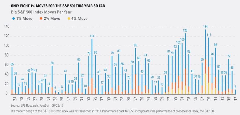
Not only have prices risen at a faster pace than earnings, but they have done so with minimal volatility. LPL Research produced the above graph illustrating how many 1%, 2%, and 4% movement days we’ve seen each year since 1950. We’re on pace to have the least volatile year (at least in these terms) in over 40 years. That’s hard to believe when compared to the headlines.
So what do we do with a market that seems to be both “under-volatile” and overvalued? As Charlie Bilello with Pension Partners points out, “the CAPE (Cyclically Adjusted Price to Earnings Ratio) is 85% above [its 146 year] average, meaning the S&P 500 would need to drop 46% tomorrow for valuations to move back to their historical average.” But that doesn’t mean we’ll see that drop tomorrow…or at all.
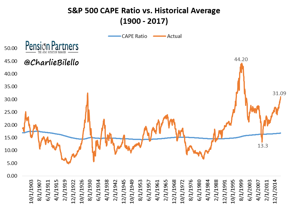
Bilello goes on to show extremely long periods when the market was both far over and under valued. In fact, he paints a picture much like Lake Wobegon where all the CAPE ratios are above average: “in the last 20 years, the S&P 500 has sported a CAPE Ratio above its historical average 97% of the time.” Not surprisingly, these periods of decreasing CAPE ratio have come during periods of deleveraging, referenced in our previous blog post on the economy.
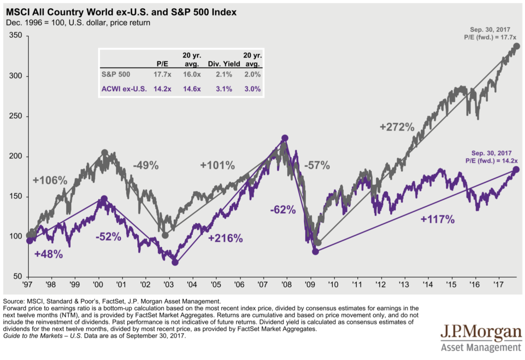
This is the benefit of diversification. As we pointed out in our last commentary, predicting the future is hard, if not impossible. And even if we had complete knowledge of the future, the path to successful investing would still be impossibly hard to stomach. We believe it makes sense to heed signposts which point to possible dislocations in the market. For example, one such signpost is that US markets seem to be selling for far more “dollars per square foot” than foreign markets, as seen above. However, this sort of information needs to be taken into account within the context of an investor’s stomach for risk and their plan’s ability to take on risk.


Justin Smith
Latest posts by Justin Smith (see all)
- Tariffs and a Declaration of Parental Independence - April 11, 2025
- Quarter in Charts – Q1 2025 - April 11, 2025
- Quarter in Charts – Q4 2024 - January 22, 2025