The Quarter in Charts – Q4 2018
The Year That Diversification Missed
The chart above captures much of why investors felt they had nowhere to hide in 2018; because they didn’t. For the first time in decades, no major asset class beat inflation. Meaning, if we could travel back in time a year, the absolute best investment for most investors would have been a CD. The chart below shows more detail behind the returns.
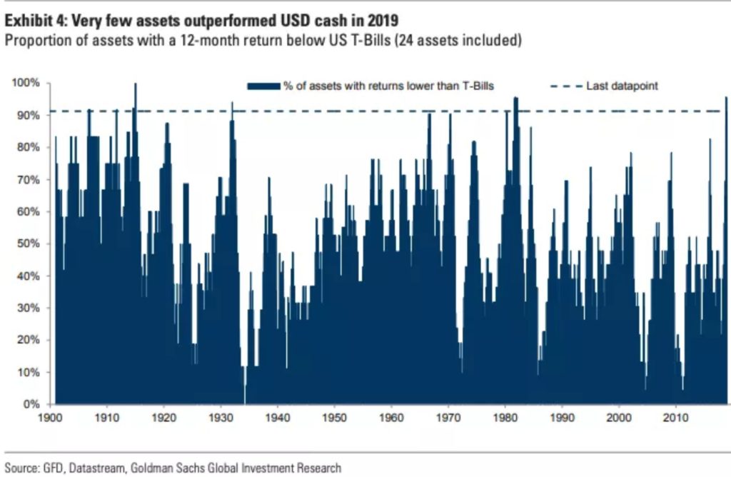
To show how rare the uniform underperformance was, the chart below shows the percentage of 24 different asset classes with returns less than short term t-bills. Roughly 95% of the asset classes did worse – the highest percentage in over 100 years!
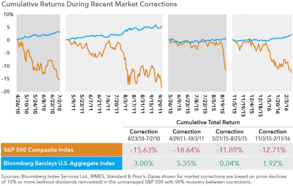
While this is an unwelcome occurrence (especially for an investor with a shorter timeline or lower risk tolerance), it is not especially surprising. At the beginning of 2018, bond yields and the prospect of rising interest rates didn’t make bonds an attractive haven. However, we don’t expect this anomaly to continue, now that bond yields are healthy and interest rate increases are expected to slow. To put it in the words of a client of ours, the chart below helps answer the question: “Can you remind me why we own bonds again?”
What Was “Normal” About 2018?
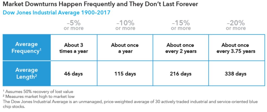
So while the correlation among assets was atypical, the return of volatility was anything but. The past year felt like a shock to investors partially because the downturn happened so quickly (all in the 4th quarter). But even more than that, I believe the average investor had forgotten what volatility felt like. The table below from American Funds, details the frequency and length of large drawdowns over the last 117 years. On average, a 20% drop happens about every 4 years and typically lasts less than 1 year.
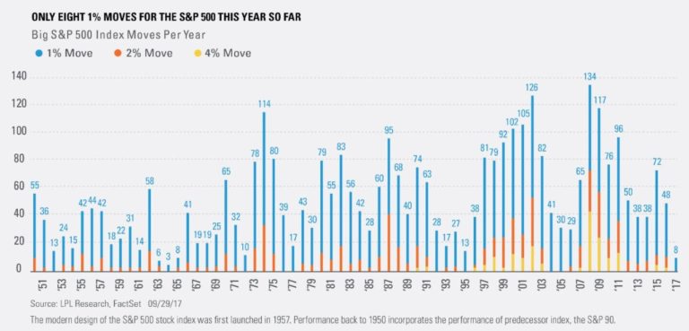
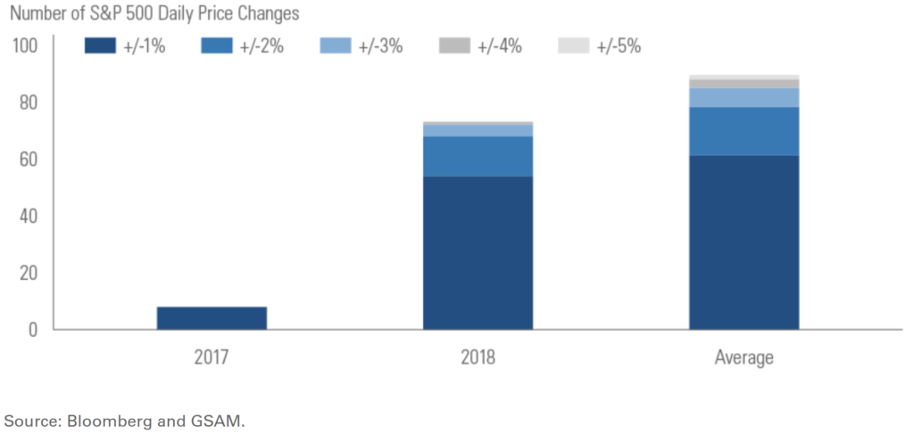
Comparing the number of large percentage change days in the market, take a look at 2017 vs 2018 vs the annual average for the S&P 500 since its inception. It is no surprise that 2018 felt much more monumental than 2017: we had 7 times as many days when CNBC could point out a +/- 1% or greater move.
Where Are We Now and What Is Ahead?
From the peak to the lowest point, the S&P 500 declined 20% (even though it only held for a day) and left most investors wondering if a bear market is looming. As we mentioned in our recent blog post, we don’t predict a bear market, but math tells us to expect one. Take note on the chart below that the pain of bear markets in the US is frequent but short-lived (though they feel like they last forever).
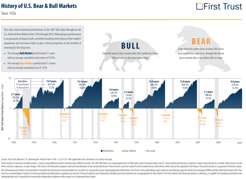
The chart above is also helpful to remember the role of recessions (grey areas) and investing. While we’ve had two major bear markets without a recession (Cuban Missile Crisis and 1987 Stock Market Crash) we’ve also had many more bull markets which have slogged their way through recessions.
We’ve used this analogy often in the past, but buying investments is much like buying a house. While you can make improvements to a house or even strike oil in your basement, most of your return depends on 1) what you paid and 2) how long you own it. It is typically easier to make money on a house you purchased for $100 per square foot than if you’d paid $200 for a similar house. It is also typically easier to make more money if you have the freedom to sell it anytime in the next 1-10 years than if you need to sell it next month.
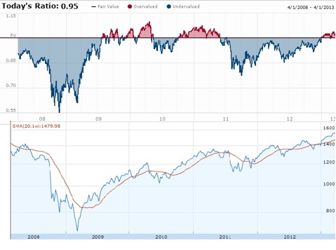
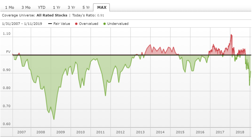
The chart below shows Morningstar’s Price to Fair Value chart for the overall market. You can think about a Zestimate from Zillow (an online real estate site which estimates the value of all houses, whether on the market or not.)
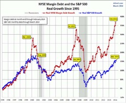
Today, Morningstar estimates that the market is selling for about 91% of fair value (in other words, a 9% discount to its real worth). That is typically a good time to stay invested. But just like we can see in 2007-2012, the real value of a house is determined by buyers and sellers, not Morningstar or Zillow. It might be irrational for the market to sell for a 9% discount, but as I like to modify the old saying “markets can stay irrational longer than you can stay patient.” This is why diversification is so important.
As we noted in our other commentary, one of the shortfalls of market commentaries (this one included) is that it makes no mention of:
- The gifts you want to make to your grandchildren,
- The second home you’ve been thinking about,
- The uncertainty in your job,
- The new health diagnosis you’re dealing with,
- The offer on the table for the business you’ve grown over the last decade,
- Or the thousand other possible important variables in your life that are far more than just “inputs”
Market commentaries can be helpful waypoints but are always incomplete when viewed outside of an ongoing, comprehensive financial plan. We can’t count the number of times we’ve said: “the math likely says to do X but we’d recommend Y” or “the market looks A but we know B is really important to you, so let’s do something different.”
While we love being students of the market, we’re equally (if not more) concerned with being students of our clients. We don’t know what we’ll write in our recap of the markets next year or what you might write in the recap of your life, but we look forward to talking through both with you along the way.


Justin Smith
Latest posts by Justin Smith (see all)
- Tariffs and a Declaration of Parental Independence - April 11, 2025
- Quarter in Charts – Q1 2025 - April 11, 2025
- Quarter in Charts – Q4 2024 - January 22, 2025