Quarter in Charts – Q1 2021
So much over the last year has felt like it belonged in a movie rather than real life. From COVID to the election, from social unrest to working and schooling from home.

So much over the last year has felt like it belonged in a movie rather than real life. From COVID to the election, from social unrest to working and schooling from home.
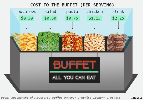
Much like the buffet lines, the financial media served up a lot of “food” this year, not all of it of substance. In an effort to cut through to what is most important and what we need to pay attention to going forward
From an economic and investment perspective, saying that the first quarter (particularly March), was without precedent is an understatement. Investors experienced the fastest bear market (from Peak to -20%) ever recorded in US stocks. But it wasn’t just down days that we experienced; we had plenty of dramatic positive days as well. As Nick Maggiulli…
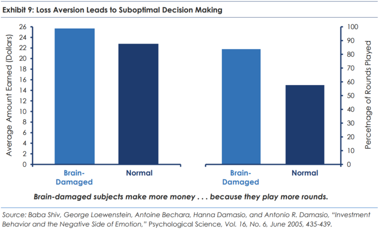
It’s interesting to think about what an impact Julius Caesar had on the calendar and from that, our lives. I remember when I started at Smith Partners Wealth Management (then Jonathan Smith & Co.) in 2005. The great Legg Mason Value Trust mutual fund manager Bill Miller was in the middle of his 15th consecutive…
I come from a long line of people who can’t keep track of their things. When I was a kid, it was my soccer cleats or my homework. My dad (you might know him as Jonathan) would try to help. He would ask if I looked in the den or on the back porch. When…
On the heels of a rough end to 2018, we’ve seen the largest increase in the S&P 500 to start the year since 1997. The chart below from Charlie Bilello details the other top 10 first 127 trading days of the year since 1928. And before your eyes drift to the red, remember that you’re…
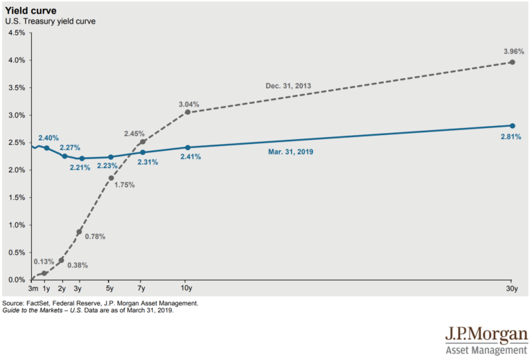
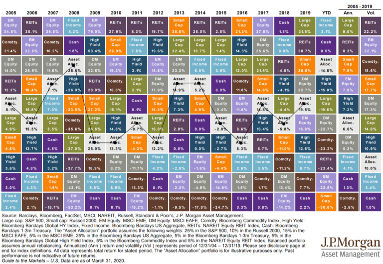
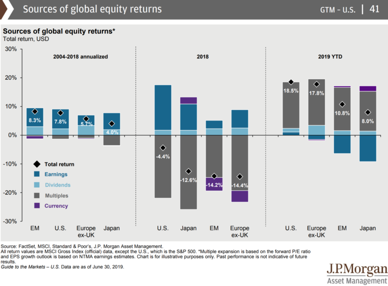
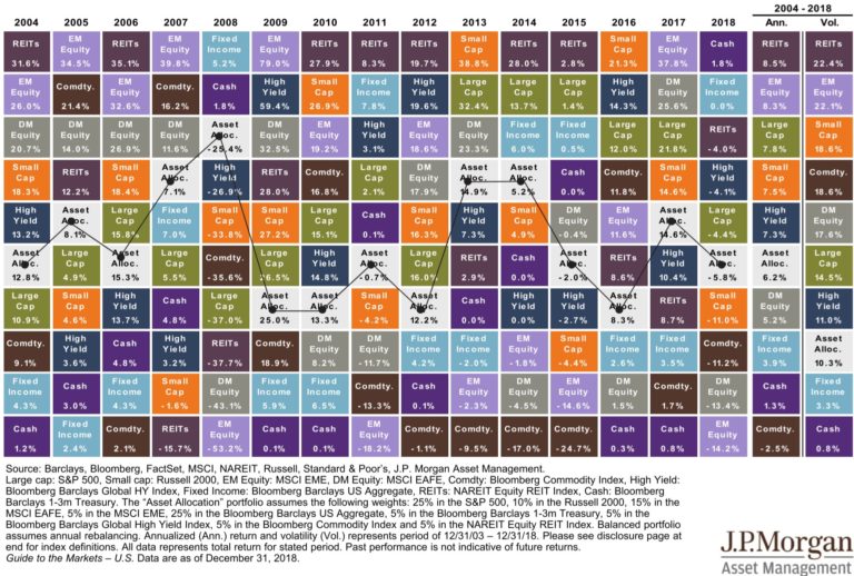
If there was ever a quarter that demonstrated the changing nature of investment markets, it was the first quarter of 2019. Below, we’ll walk through the critical themes of the quarter touching specifically on the yield curve and the possibility of a recession. Asset Class Returns So far in 2019, investors have experienced double-digit returns…

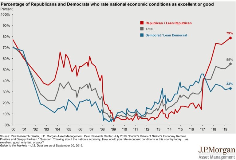
“They were told where they belonged, and they acted accordingly.” In his book, Predictably Irrational, Dan Ariely highlights how our understanding of our current situation impacts how we will behave in the future. “One stereotype of Asian Americans, for instance, is that they are especially gifted in mathematics and science. A common stereotype of females…

(Updated: In an earlier version of this post, I couldn’t recall the name of the children’s book I reference throughout. I offered a $25 reward, payable to the sleuth’s charity of choice, for anyone who could help me. In less than a day, one of our readers emailed me the title “The Creature Department”. I happily…
At Smith Partners Wealth Management we evaluate each prospective client for best fit. We would be glad to meet with you to understand your needs and determine whether you would be well served here. To learn more about becoming a Smith Partners client, please contact us. We welcome the opportunity to speak with you.