Quarter in Charts – Q1 2021
So much over the last year has felt like it belonged in a movie rather than real life. From COVID to the election, from social unrest to working and schooling from home. Thankfully, our three kids kept their regular school schedules, and I came into the office as usual – so the majority of my surreal moments came in everyday circumstances. Like when I realized we were Clorox wiping our bag of groceries, which included a pack of Clorox wipes.
My most surreal COVID experience came a little over three weeks ago when I got my first dose of the Pfizer vaccine. We followed the giant traffic signs into the Four Seasons Mall FEMA site. We got there 20 minutes before closing time and found the mall packed with face-masked shoppers. There were 20 people in line outside Footlocker and the Easter Bunny posed behind a picket fence barrier. My wife and I were greeted by men and women in fatigues from the Air Force and National Guard; most seemed half my age. We sat in the defunct Dillard’s department store in folding chairs, received our shots en masse, and were out in time to smell the Cinnabons.

We can’t escape the impact of COVID on any part of the financial markets over the last year. As the US starts to round a corner (chart below), investors will enter into a new set of obstacles and opportunities. In this Quarter in Charts, we’ll focus on how COVID has shaped the Government’s Financial Response, Future Inflation, and the Makeup of Expected Investment Returns.
Over the last twelve months, we’ve witnessed a Herculean effort by the Government. The rescue effort (from interest rate reductions to asset purchases, from unemployment assistance to child tax credit changes) are too numerous to detail here (for a complete list, visit the IMF’s recap of every countries’ policy response, then search for “United States of America.”)
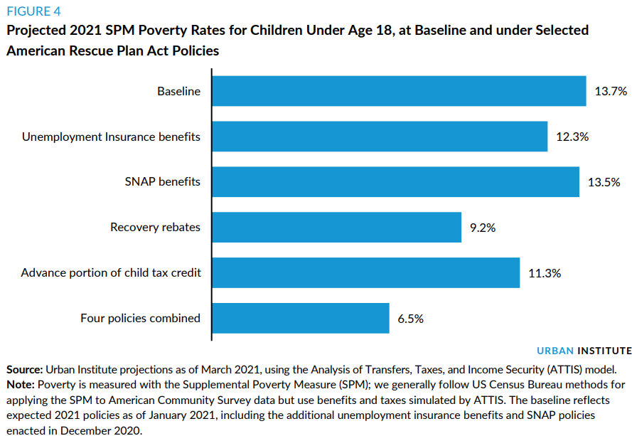
It is easy to see the upside of the government’s intervention: the stabilization of the bond market, the rebound of the stock market, the swift development of vaccines, and the lifelines thrown to families. And these aren’t just band-aids either. According to the Urban Institute, the combined policies of the most recent legislation alone (the American Rescue Plan) could reduce the poverty rate among children (18 and under) from 13.7% to 6.5%. With this reduction of poverty, we could see an overall increase in their quality of life for millions of kids for generations to come.
Everything My Kids Know About Inflation, They Learned from Gumball Trees (Liquidambar styraciflua)
Last Spring, our two youngest kids started a new game where they drag out all manner of tables, tools, and buckets from the garage and set to work establishing a “town” in the driveway. They then grab their pocket knives and whittle things to “sell” to each other and the neighborhood kids.
Somehow, the Gumballs in our front yard quickly became the currency of choice. This worked great because the only Gumballs to be found were in the beds that I hadn’t yet cleared out (talk about two birds with one stone!) But hyperinflation quickly ensued when Fall came, and Gumballs were everywhere! A “handcrafted arrowhead” quickly went from 10 Gumballs to 50!
Inflation seems to be a primary worry for many investors, and rightly so. Even though the Fed has pledged to keep inflation from getting out of hand, it is hard not to see it creeping into everyday life from the grocery store to the gas station (and it is on full display in the housing market and the lumber aisle for different reasons.)
As long as Gumballs remain the “reserve currency” on our block, it doesn’t matter too much if the trees keep producing them. But if some kids also start using Pine Cones as currency, then the value of my kids’ Gumball hoard will fall. The same goes for our dollar’s value. As long as we can produce, grow, and keep our place as a trustworthy currency, we can keep pace. But if that growth and prestige start to slip, inflation could be a reality we will all need to confront.
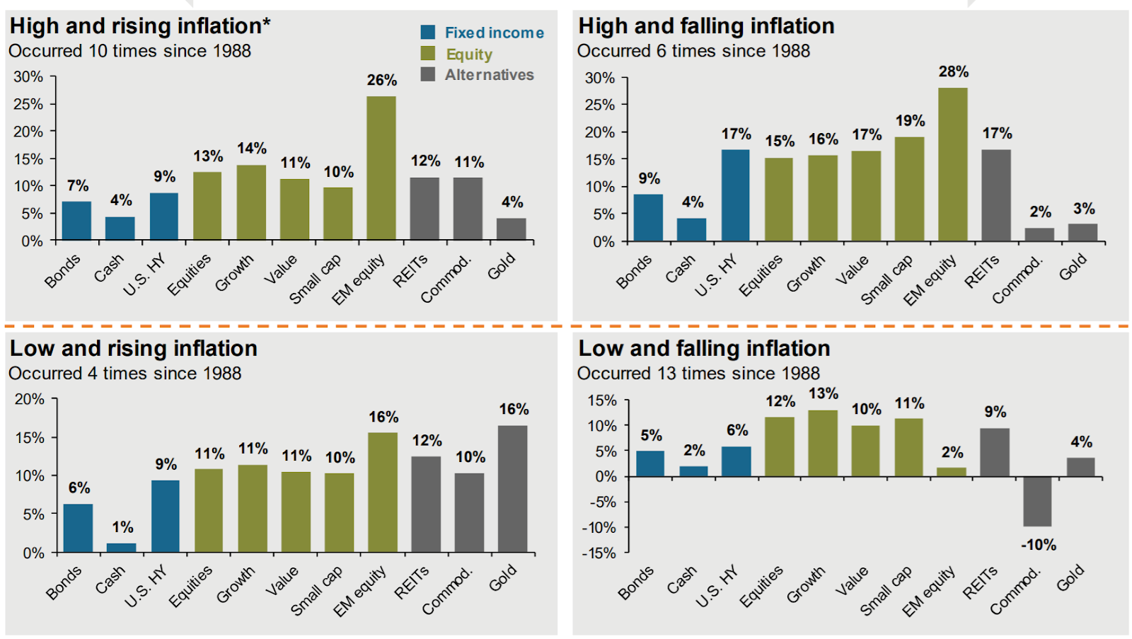
So if we’re in a period of low and (likely) rising inflation, what could we experience from investment markets? JP Morgan looked at the last three decades, splitting up the returns into four combinations of inflation starting points (High and Low) and directional changes (Rising and Falling.) Even though we have only experienced it four times since 1988, the “Low and Rising Inflation” on the bottom left seems to line up most closely with the current market.
Returns on a Leash
We’re one of the many families who finally caved and got a 2020 puppy. In late October, we brought home Nugget, a mini Goldendoodle who has maxed out at around 14 pounds. She’s been a great dog, and most weeks, she gets to spend a day or two asleep on the couch in my office.

For all of Nugget’s positive qualities, she still hasn’t overcome her utterly irrational fear of storm drains. Most of the time, when we encounter a storm drain, she slows to a crawl, then a halt, and then tries her best to cross the street. But other times, she acts like a typical dog and could not care less about the drain. Her behavior on a leash reminds me of how assets (and investors) tend to operate. We’ll look at bonds, stocks, and a balanced portfolio for some context.
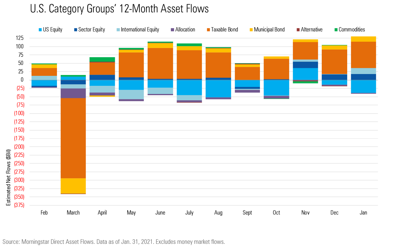
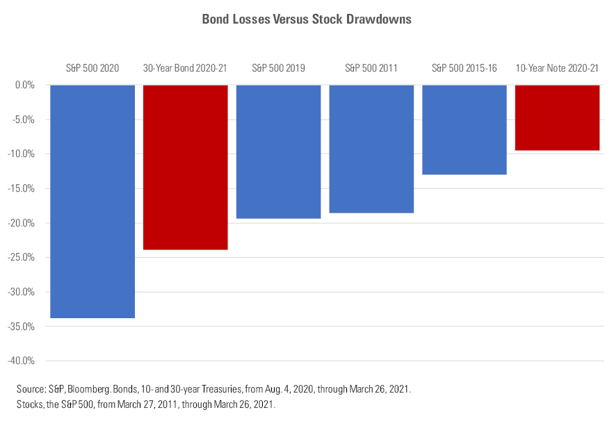
Over the last twelve months, we witnessed a mass exodus across all asset classes in March, followed by continued net outflows of Stocks and net inflows to Bonds (chart above.) And so it shouldn’t be surprising that Bonds have experienced a rough stretch since August of 2020 (chart below)
We know that stock returns are a function of dividend yield, earnings growth, and changes in P/E multiple (for more on this, see our blog post “Mama, Where Do Stock Returns Come From?”) But long-term Bond returns are primarily a function of the bonds’ yield on the day the investors bought them. The chart below shows the “Current” Yield of bonds in the blue line. The overlaid grey bar details the resulting 10-year investment return.
When the bar is above the line (like much of the 1980 – the 2010s), bond investors typically earned a slightly higher return than their initial yield would have predicted. This is because we had a falling interest rate environment. But in times like the 1940 – the 1970s, the actual return tended to fall short of the starting yield.
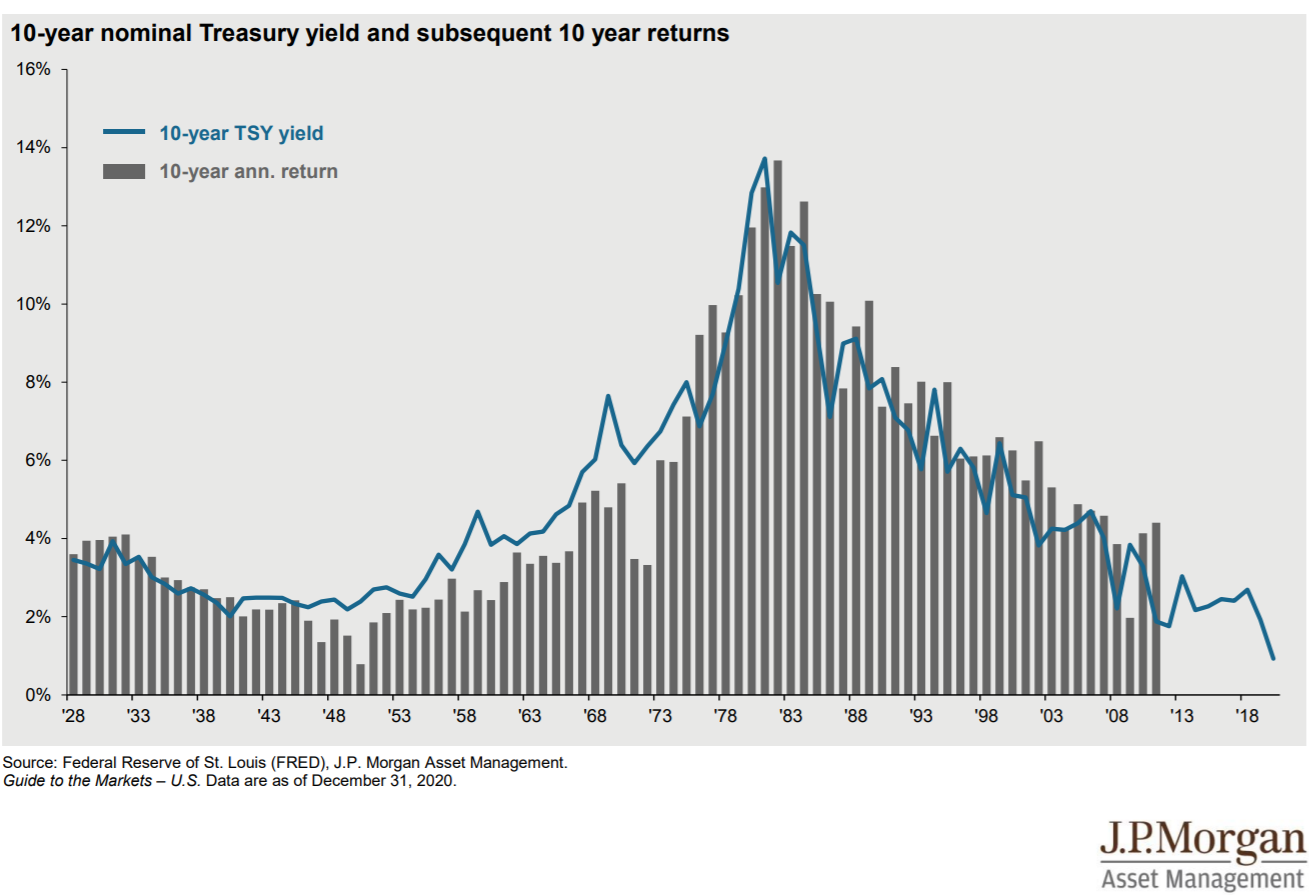
We see that the annual returns over 10 years may “stray” a bit from the initial yield, but it is rare to see any outliers. Today, investors are starting out (far right section of the blue line) with the lowest 10-year yields on record and the likelihood of increasing rates. We don’t know what the next 10 years will hold, but we would need to be irrationally hopeful to think we’ll see the same bond returns that prior generations enjoyed.
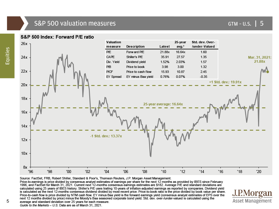
Investors have found a similar situation when we look at the valuation for stocks. Currently, the S&P 500 is selling for 21.88x Forward Earnings. In other words, investors are willing to pay $22 for every $1 that a company is projected to earn. This is far above the 25-year historical average of 16.64x (chart below).
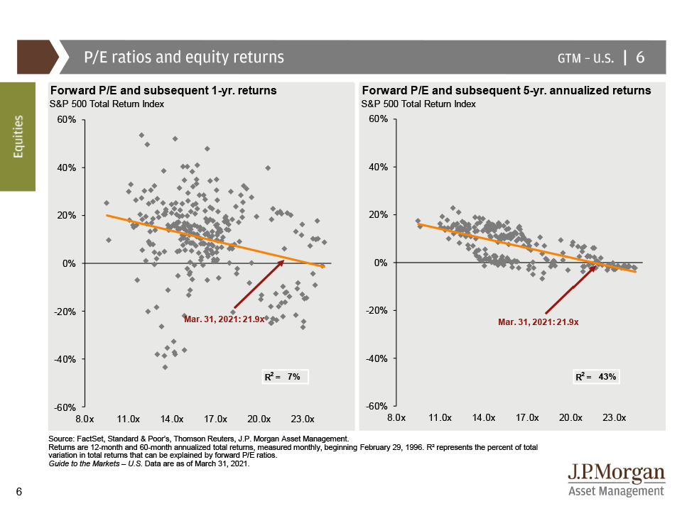
But should it matter how much I pay for a dollar of earnings? In the short term, no. On the left side of the chart below, we see that P/E ratios are a horrible predictor (or explainer) of 1-year returns. Historically, some investors who started at 22x experienced -20% 1-year returns while others experienced +20%. The starting P/E can explain only 7% of the variation in 1-year investment returns.
However, when we zoom out to a 5-year return window (right side of the chart), we begin to see a pattern and discover that the starting P/E can explain 43% of the variation in return. When investors start their 5-year time periods in environments like today (21.88x P/E), the odds of earning an outsized return are stacked against us.
Two Dogs on a Leash
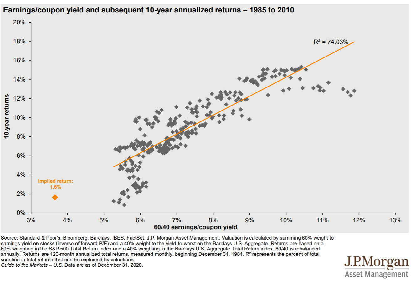
When we pair the starting points for Bonds and Stocks together, we get an interesting mix. We have already talked about how investors are “paying a lot” for both, and the resulting 60% S&P/40% Aggregate Bond portfolio is in some uncharted territory (below.)
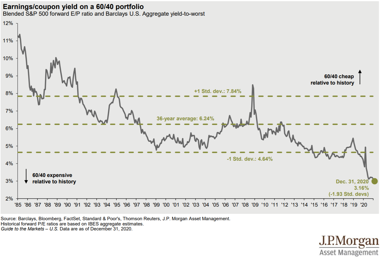
When we look at historical 10-year returns for this 60/40 portfolio, we find that the combined starting point for Stocks and Bonds can explain 74% of the return over ten years. So if we took all of the data we already know and tried to predict where a 60/40 portfolio could end up in 2031, the math would show an implied return of 1.6% annually. While that is far from appealing and hard to grasp, we can see that investors have experienced 10-year periods of returns even lower than that.
Don’t Release the Hounds!
The last year has been an emotional rollercoaster for investors with new highs and lows, endless news feeds, and ever-changing tax laws and business environments. We think a successful investor is one whose financial plan and investments allow them to live life in the way they were meant to live it.
For most folks, that means knowing that their plan is their plan. I love BlackRock’s chart below because it captures so well the short-term pain of diversification if my focus is on the wrong data point.
The investors who can replace the “I lost money” and “I didn’t make as much” with “I’m still on track with my plan” are in a much better place, regardless of how much money is in their portfolio.
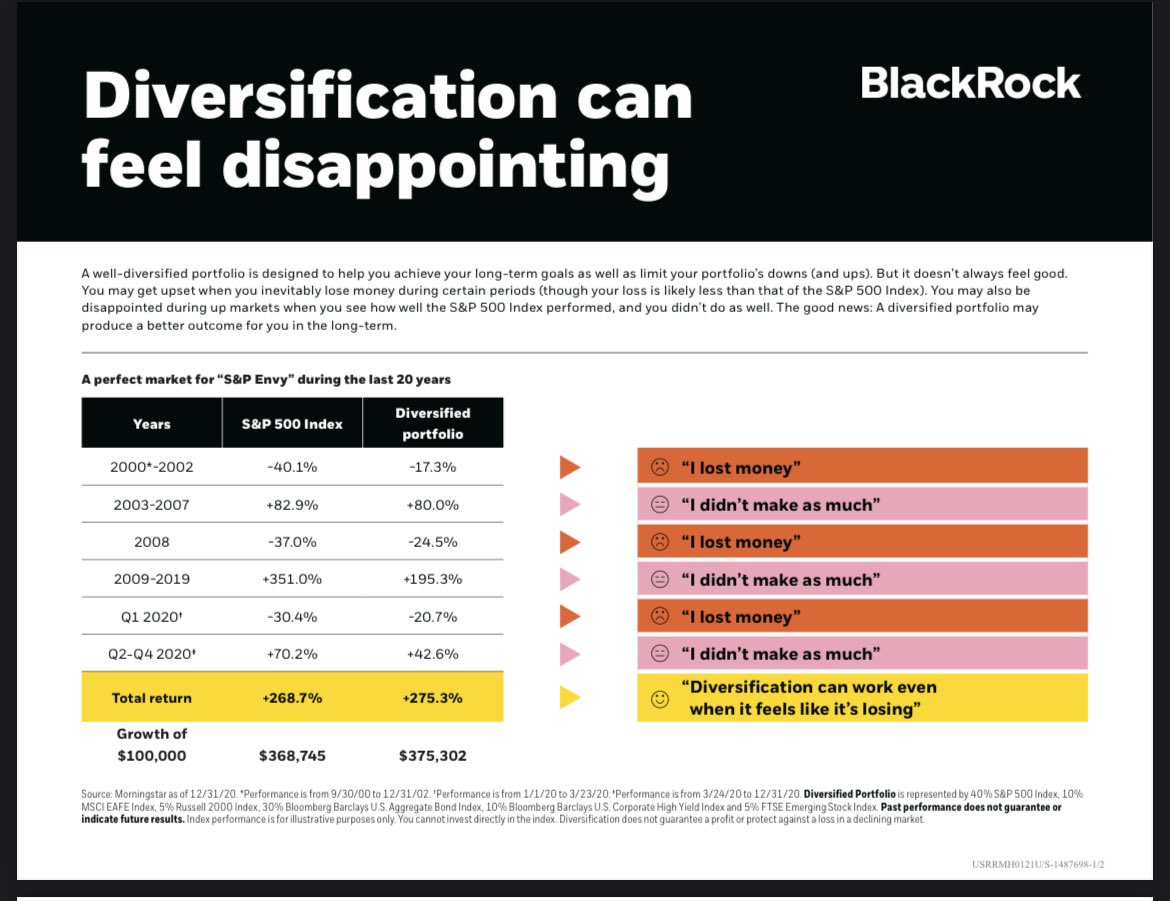
We don’t know what the next 1, 5,10, or 30 year periods will hold. But we do know that at some point along the way, investors will feel like they can’t win…and at some point, they’ll also feel like they can’t lose. And they’ll likely be wrong in each instance. Diversification and a focus on your financial plan and what is important to you are far more important than the latest investing headline.
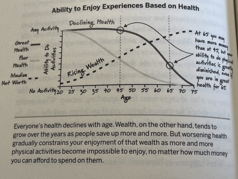
To that end, I’ll leave you with what may be the most important chart of the quarter. I ran across this on Tadas Viskanta’s Abnormal Returns blog post Enjoying Life While You Best Can, where he references a chart (below) from Bill Perkins’ book Die With Zero. Now I might not agree with the slope of the lines (I know some very active 60, 70, and 80 year-olds) but the principle is worthy of attention. Comprehensive financial planning should place just as much focus on a chart that details life enjoyment (in whatever form that takes) as it does a chart that describes P/E ratios.


Justin Smith
Latest posts by Justin Smith (see all)
- Tariffs and a Declaration of Parental Independence - April 11, 2025
- Quarter in Charts – Q1 2025 - April 11, 2025
- Quarter in Charts – Q4 2024 - January 22, 2025