So, How Was Your Day? Your Quarter? Your Year?
It’s hard to wrap my mind around the wildly different experiences we’ve all had over the last four months. For every quarantined person who has learned to bake sourdough, many more kids aren’t getting their school lunches. For anyone who has realized they can do their job faster and better without worksite distractions, there are many more who are juggling the roles of parent, teacher, worker, and healthcare expert. If we ask someone “How was your day?”, it’s hard to know what answer we’ll get.
I discovered an interesting chart (h/t @philbak1) that displays the range of perceived connotations to different words/phrases used to describe something.
A few takeaways (highlighted in blue below):
- “Abysmal” seems average for a surprising section of the population,
- Evidently, some people read “appalling” as “appealing” and,
- Somehow “perfect” still isn’t good enough for some people.

The investment markets over the last six months would elicit any of the above responses from investors, depending on their investments, their financial plans, their work prospects, their proximity to people impacted by COVID-19, and the news channels they watch. This is all for a good reason; we’ve seen some historic disparities show up in several places: Growth vs. Value, US vs. Foreign, Fixed Income vs. Itself, and The Stock Market vs. Reality.
Growth Vs. Value
2020 has been a historic year when you look at the components of investment returns in the US. While the US Market as a whole was down -3.11% year to date (see below), when we peer through for a breakdown of that return, we see a wide disparity. The difference between small (-14.17%) and large-cap (-0.69%) stocks isn’t surprising because larger companies have less volatile earnings, more access to capital, and tend to be bellwethers in a downturn. But the year to date difference between Growth (+14.92%) and Value (-18.53%) is the widest it has been in two decades.

For a bit more context, here’s the same data for the second quarter, trailing 12 months, and 3 years.
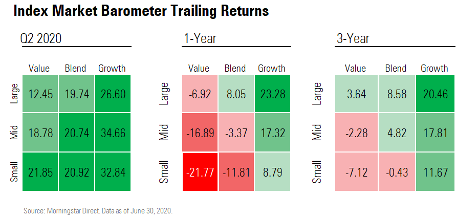
For an investor with a large allocation of stock funds, they’ll answer “How was your year?” much differently depending on how diversified they are. For the diversified investor, it might sound like “OK” but for the person heavily tilted toward Growth stocks, it is a wildly different story (maybe they would say “Perfect”.)
But what should this relationship look like for the long term? Before we answer that and look further into the other areas of variance, I want to talk about who is really “doing the work.”
Who is Doing the Work? And is That How it Should Be?
How can you see this graph below and not laugh? The New York Times found that 45% of men think they spent more time than their spouses homeschooling their kids during the quarantine. However, when they asked women, an astounding 81% said they spent more time. I’m pretty sure I know who is wrong here (the men!)

This spring, we had to reexamine who was doing the teaching work in our house and ask ourselves if that’s how it should be. One week, my wife asked me to read and help explain a science chapter to our kids. They were learning about how animals find and attract a mate; well within my wheelhouse!
The problem came the following week when our 4th grader, Finley Cate, was called on to read her answers aloud to the class. When asked why male deer have antlers, she read aloud what I had apparently taught her: “They use their antlers to fight other male deer so they can impress their lady friends.” Whoops. Thankfully I think she was more proud than embarrassed.
In investing, it is essential to ask where returns come from (“Who is doing the work?”), but it is equally important to ask the follow up: “Is that how it should be?”
In the case of Growth vs. Value, we’ve seen that Growth has been doing the work this year (and for many years recently.) It is understandably tempting for investors to swing wildly to Growth. But we need to look at some larger frames of reference. When we look at the last 92 years, Growth hasn’t always outperformed. In fact, historical outperformance has been much more of a Value trait, by an average of 4.54% per year. (If you’d like to look back even further, you might be surprised to see that the case for Value might go back a couple of centuries.)
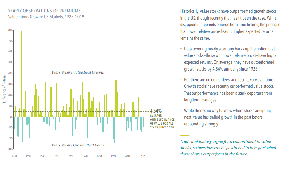
I’m not saying that just because Growth has dominated 10 of the last 13 years, it can’t continue to outperform. It certainly could, and that is why it has a place in an investors’ asset allocation.
But an extreme tilt to Growth doesn’t stand up to our Time Machine Proof Theory. I’ll explain. Simply put, we think the most appropriate portfolio is one that could stand to enter into a time machine with its investor, travel to any random year in the past, and still make sense for that investor. In real terms, just as I wouldn’t want an All-Value portfolio and then travel to 2008, I also wouldn’t want an All-Growth portfolio and travel to 1939 (when Growth only outperformed 3 of 16 years.) The same will apply to how we think about Bonds, Foreign Stocks, and the market as a whole.
Foreign vs. US
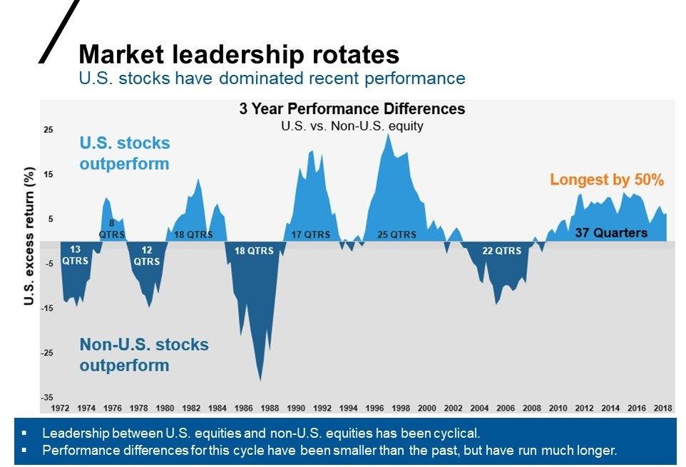
We see a similar cyclical relationship when we look at Foreign vs. US stocks. US stocks have done the heavy lifting over the last decade; however, over the previous 50 years, we’ve seen a much more back-and-forth relationship between US and International equities.
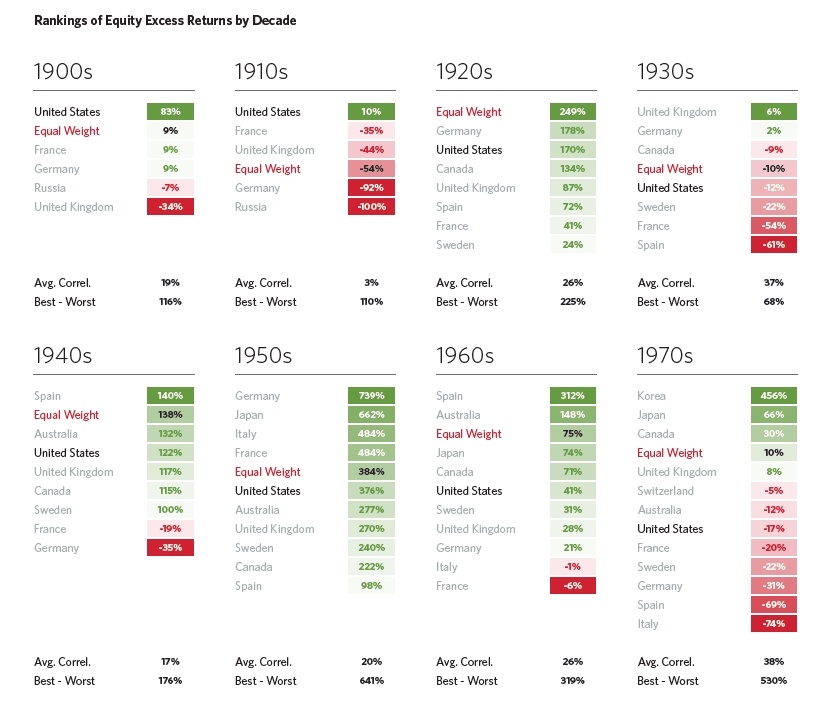
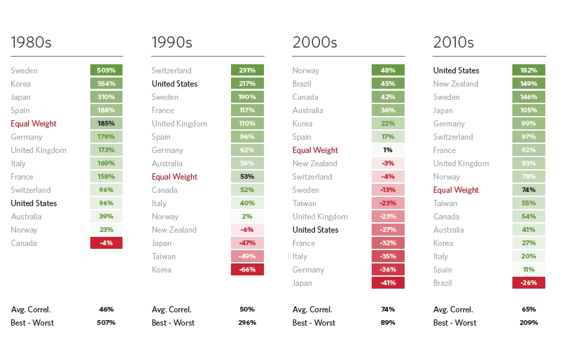
Going back even further, here is a fascinating chart from Meb Faber detailing the investment returns for various countries along with an equal weight non-US international equity allocation. We can see in the following chart that US returns were better than average in the 1900s, 1910s, 1990s, and 2010s. However, our recency and home country biases shouldn’t get the better of us.
As this disparity continues, we see that the US Stocks begin to take on premium valuations. We liken this to a house that has a higher price per square foot than its neighboring homes. Just like some houses with an updated kitchen or new HVAC might command a higher price per square foot, there is a point where that price discrepancy can get out of hand.

For the last 20 years, International Stocks have sold for a 12% discount to the US in terms of Price to Earnings ratio (think Price per Square Foot.) This lower price on Foreign has been well-deserved; the US has been a hub of sound policy, innovation, and economic growth. But today, that discount on Foreign is more like 23%.
As we see on the left below, the US makes up roughly 25% of Global GDP and 36% of investable global markets but occupies 72% of the average US investor’s portfolio. Again, we don’t know if the Foreign performance gap will widen, but we certainly see the case for a portion of an investor’s portfolio allocated across the seas.

Fixed Income vs. Itself
As we entered 2020, the majority of Bond funds were riding high on the tails of a declining interest rate environment. The Federal Funds Rate hovered under 2%, and it was hard to imagine how Bonds might continue to do well in the coming year: a booming economy surely meant increasing interest rates…right?
And then COVID-19 happened. When interest rates plummet, existing bonds become more attractive, long-dated Bonds even more so. As the corporate bond market showed signs of cracking, the Fed came to the rescue buying up Treasuries, Corporate bonds and even Bond ETFs.

But while low-interest rates create an appealing environment for refinancing mortgages and other lending, they induce a drag on a conservative portfolio trying to keep up with inflation. As seen below, a savings account has no chance of keeping up with compounding enough to meet the needs of rising prices. Currently, few bond sectors present attractive returns for their level of credit or interest rate risk, driving more investors to continue piling into equities.

The Market vs. Reality
Most anyone I talk with or read has had a hard time reconciling the headlines on the front page with the headlines in the market. As Web Smith put it the “the cognitive dissonance is dizzying. ”

The government’s rescue intervention has been something to behold. From stimulus checks to business loan forgiveness to interest rate cuts to asset purchases, these measures were real forces that the markets had to reckon with. But sometimes it still feels like Mr. Market quit watching the news.
However, this isn’t the first or last time that the market seemed disconnected from the “real economy.” As The Leuthold Group points out (h/t Carl Quintanilla) the market often looks beyond (rather than overlooks) the bad news. Leuthold highlights the last four major US shocks to see how the market (in red) rebounded before the underlying sectors of the economy (blue) revealed good news.


We can’t predict the newspaper headlines in the coming months and years in terms of COVID-19, the election, the economy, or the markets. We also don’t know what will be in our own personal “headlines” in terms of life events. However, we do know that diversification works in the long run, but can produce some regret in the short term. The key to fighting that regret is to have a living, breathing financial plan that adapts in step with our life event “headlines” more than newspaper headlines.


Justin Smith
Latest posts by Justin Smith (see all)
- Quarter in Charts – Q1 2024 - April 19, 2024
- Quarter in Charts – Q4 2023 - January 24, 2024
- Quarter in Charts – Q3 2023 - October 19, 2023