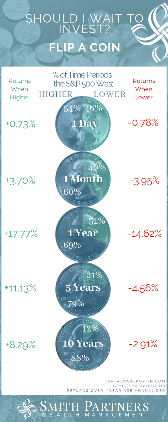
The Quarter In Charts – Q2 2018
Below are some pictures that help illustrate the current investment landscape. All of these charts show us where we’ve been, but none guarantees to show us what will happen in the future. Even though valuations tend to “revert to the mean” and certain data points can be leading indicators, nothing is guaranteed. In fact, that’s what brings us to our first chart.
Market Timing Game
This one comes from Engaging Data’s “Market Timing Game” via Eddy Elfenbein’s Crossing Wall Street blog. This simple game allows players to buy and sell the S&P 500 over an unknown (and random) three year period, sometime between 1950 and 2018. Players start with $100,000 invested, then click the “sell” button (the yellow shaded area indicates when a player has sold out of the market) then click the “buy” button when they are ready to buy back in. I encourage you to play it (the Speed 4 setting takes about 30 seconds; the Speed 3 setting takes about 5 minutes).
Over the 20 or so times I played, I had both lucky and unlucky rounds. Below, you can see that I “sold” after the market dropped 15% in 6 months. And even though I felt smart as I sidestepped the next 5% drop, it was much harder to know when to buy back in and my account suffered. It seems July 1981-84 was a “buy and hold” period. Of course, that’s the point: buy and hold is the best strategy in most but not all of the periods. We can fool ourselves into thinking that if we had some generic headlines alongside the market movements, then we could beat the game, but I believe this last 18 months disproved that. ![]()
The game also features a Monte Carlo option which will piece together three years’ worth of random days. This feature includes a red dot at each “Market High”. It was interesting to see how this bit of data changed how I played the game. Now onto some real numbers.
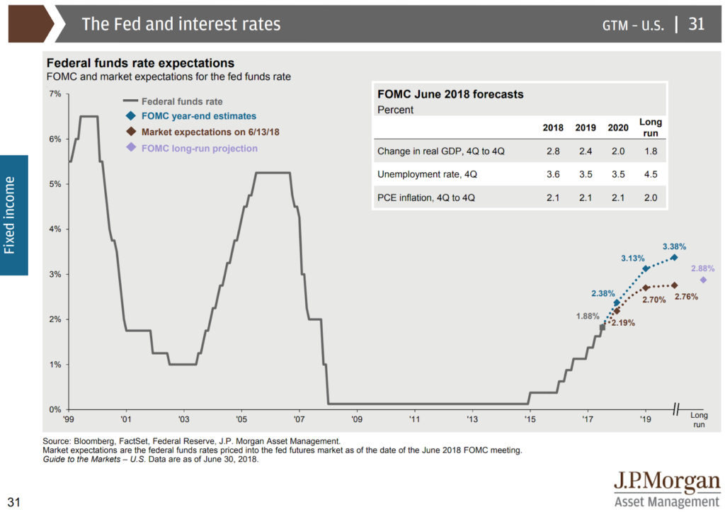
Rising Interest Rates
We’ve already experienced 4 Federal Funds target rate hikes in the last year at a steady 0.25% each time, the most recent was last month. While the Fed expects more in the future, the implied market expectations show less belief (see chart below from JP Morgan Asset Management’s “Guide to the Markets”).
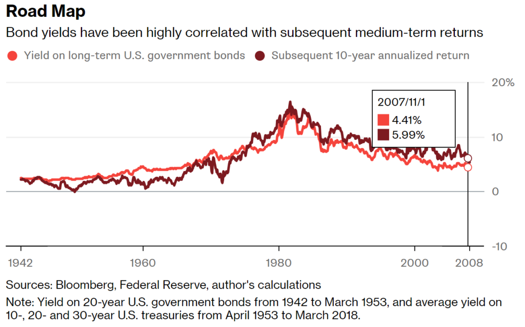
Rising interest rates, while unfortunate for current bond holders, can signal plenty of positives for future asset growth. Since future bond returns are largely a function of current interest rates (see below from Bloomberg’s “Classic Safe Haven Hiding in Plain Sight”), investors reaching for yield can now entertain more of a balanced approach instead feeling compelled to take on “risk at any cost” and we mentioned in our last Quarterly Commentary.
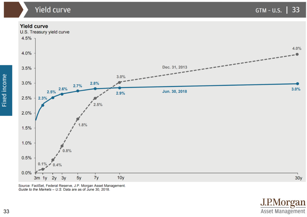
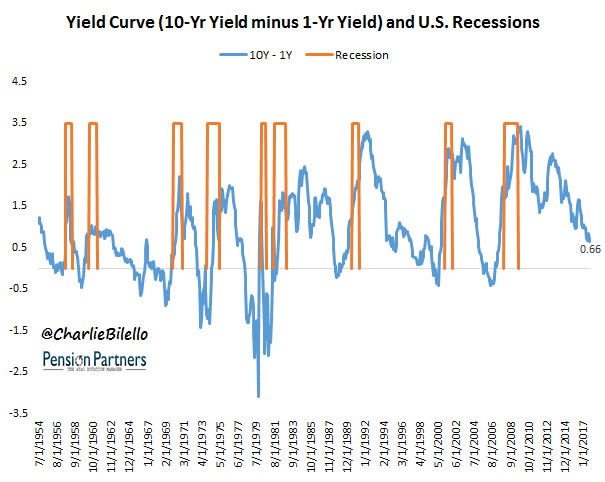
Flattening Yield Curve
However, as much as short term rates have increased, we’ve experienced a decrease in mid- term rates. The chart below shows today’s yield curve in blue and the December 31, 2013 yield curve in grey. This line is often simplified as the difference between the 10 year and 1 year Treasury yields. Today’s difference is 0.6% (2.9% – 2.3% = 0.6%) but the difference in December 2013 was 2.9% and was even as high as 3.79% in February of 2009.
The shape of this line (and more specifically its slope) is often interpreted as a predictor of the future economy and equity returns. Charlie Bilello with Pension Partners does a great job of illustrating this relationship in a recent post “The Relationship Between the Yield Curve and the Stock Market”. His chart below maps the yield curve against recessions. When the yield curve crosses the horizontal axis, it is inverted. While we’ve been at these levels previously and escaped an immediate recession (see 1994 and 1962), it is worth our attention.
Market Recoveries and Economic Expansions
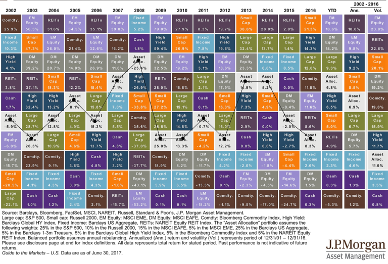
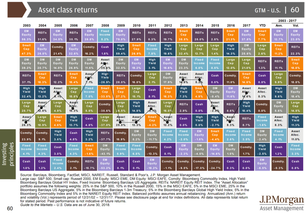
For the recent quarter and year to date, Growth stocks have largely outperformed Value while Small Caps have outperformed both Mid and Large Caps Stocks. Both areas seem to be adding to an already relatively overpriced valuation.
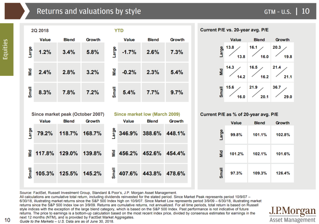
After being the star outperformers in 2017, Emerging and Developed Market Equities are down -6.5% and -2.4% respectively for the year to date. Fixed Income is set to experience only its second down year since 2003. As the last two columns below show, the 14 year returns mostly line up with each asset class’ volatility (for example Emerging Market have returned the most and had the most volatility).
Just like the Market Timing Game at the beginning of this blog post, all of these charts (and this one in particular) serve as good reminders of the unpredictable nature of returns and the need for a plan along the way.


Justin Smith
Latest posts by Justin Smith (see all)
- Tariffs and a Declaration of Parental Independence - April 11, 2025
- Quarter in Charts – Q1 2025 - April 11, 2025
- Quarter in Charts – Q4 2024 - January 22, 2025